Category Archives: Interiors

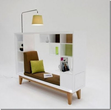
Where do you read? Wish it was somewhere like this?

Yesterday was officially the longest day in the UK so there is no denying it summer is here. This is the time of year when I get the chance to relax and do some reading but at the moment, my room being decorated I am bunking in my sisters room and I find it impossible to read in there. It just doesn’t work somehow. It got me thinking, if I could design a reading spot what would it look like?

Here are some other designers ideas…

House-on-the-Flight-of-Birds-Architecture-4-600x399

House On The Flight Of Birds, Portugal by Bernardo Rodrigues features this beautiful little window seat. Great for kids but I just hope they also included an adult sized version!

I love architectural details such as that above but for those looking to add a reading nook to their home how about some of these pieces of furniture below.

Untitled-1

This bookcase with built in seat is called Cave and features an ergonomically shaped seat with reading light above. Again I think this is a great idea for kids but I can’t actually imagine using it myself.

book div

This is more like something I can imagine using, less claustrophobic and higher off the ground, this angular design by Guy Eddington is great. Something that could fit in with your furniture without being obtrusive. For me a place to read should be quiet, discreet and this ticks those boxes.

0ifsodoso01

Discreet is certainly not how you could describe this seat, with built in shelving by Etsy. I do like its form but for me it conflicts with the nature of its use. A more subtle version, less neon, more natural would be fantastic!

Leave a comment

Filed under Furniture, Interiors, Just For Fun

The UCLAN Creative Festival–Great Presentation Ideas You Could Reproduce

New to UCLAN studying my Masters I had not yet seen a degree show at the university so it was great to pop down to the Creative Festival on Friday and see what was on offer. A number of different departments had work on display, each department varying its presentation technique, below are some of the best bits.

IMAG0521

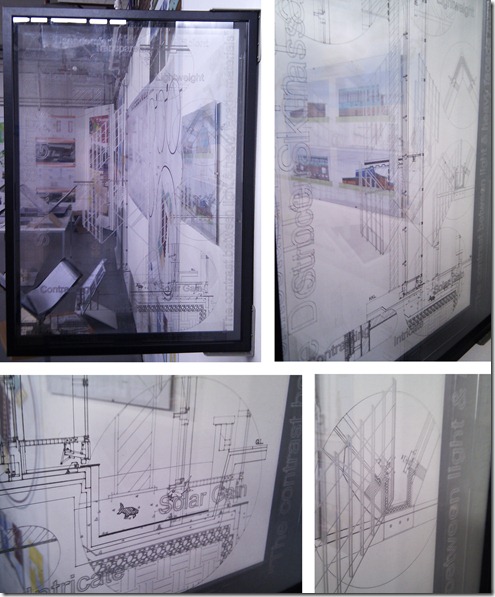
I first came across the Architecture degree show. Having studied Architecture for my undergrad at a different university it was interesting to look at how the styles differed from course to course. One piece stood out in particular for me. Bruce Johnson managed to take a, lets face it dull wall section and turn it into a piece of art (below). Unfortunately the full affect doesn’t come across on camera but Johnson had had layers of plastic laser cut, each plastic sheet depicting a different layer of the structural build up. The layers were then framed and then fixed perpendicular to the wall to give the greatest effect. I have found that the presentation of structural diagrams is something that is often ignored. This is understandable as legibility is a key factor but it was refreshing to see someone really pushing the presentation of this type of drawing.

Arch Drawing

Next up the Illustration Degree Show. A great collection of work with many unique styles on display and some beautiful display techniques. I particularly liked the use of picture frames and the way sketchpads and associated materials were displayed alongside large prints. My favourite work was by that of Naomi Jones (bottom left of the picture below), a full post about her work should be right below this one, or click here to read more.

Illustrations

Finally the Interior Design Degree Show! I may be biased but this was my favourite of the shows. The collective standard of the work was excellent and some great display techniques had been incorporated into the show.

IMAG0490

The course managed to combine technology and more simple materials together throughout the exhibition extremely effectively, managing to present the students work clearly and professionally.

IMAG0499

I particularly liked the cardboard display tables that had been produced to show models and the students portfolios. So clever, with a simple design that was produced in house, the result is neat and gives uniformity to the display. That combined with a bulb hung over the display table gives each student their own defined exhibition area.

Cardboard and hanging bare bulbs are both items that are extremely on trend in the world of interior design at the moment. To incorporate such objects into the exhibition is a great idea, it really shows that the students know what is happening in interior design, outside the confines of the studio.

Interior Design Display

UCLAN students are lucky enough to have access to a laser cutter. The intricate models below by Paula Ambler and Charlotte King show the high standard that can be produced at this level using such equipment.

Laser Cut Models

As in all departments the abilities of students varies. Many were able to produce high quality computer renders to give a real understanding of a space. This is something I aspire to be able to achieve myself but have not as yet learnt how to do. At this point I have been looking at the methods of producing visuals that don’t rely on complex visualisation packages. That is why the image below by Emma Brady really stood out. Bright, colourful and fun I was instantly drawn to it. It certainly gives an impression of the space in a more artistic way than just computer renders. I may give this kind of style a go myself!

IMAG0495

Many of the students had also provided business cards with some great illustrations reflecting the individual style of the student. Something that really caught my eye was this fold out portfolio disc case by Emma Cairns. Simple to produce but with bold graphics, the object reflected the students personal style well and gave a glimpse of her creativity before you even got to view her full portfolio. With employment at a low nationally, I do hope little tricks like this help give the students an advantage when it comes to finding a job in the future.

Portfolio Idea

Leave a comment

Filed under Architecture, Art, Exhibitions, Interiors, Models

Stylish Cables

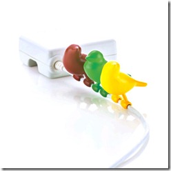
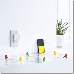
We really are living in a world where every tiny mundane part of everyday life is being redesigned to incorporate a bit of fun! and I love it! New concepts are popping up everyday, some better than others but it is the work of iida a Japanese company that has really stood out for me lately. The company produces a great range of designs, that take a slightly different look at objects we use all the time.

LS1P002A_L_03LS1P002A_L_02

Above and below are great example of this approach. The designers at iida have produced a series of AC adapters where a feature has been made of the cable, something that would normally be considered an eyesore. Birds, army men and Alice in Wonderland are amongst the designs available to buy on the company shopping site.

LS1P004A_L_01LS1P004A_L_03

I think this is a brilliant idea. A product that I could definitely see being copied and mass produced across the world. It would be great for a teenagers bedroom or just for adults with taste on the quirky side (like me!). The bird option is certainly going on my wish list!

LS1P003A_S_01

Leave a comment

Filed under Interiors, Just For Fun, New Uses

Leeds Met Creative Arts Festival. A Creative Event In Itself.

On the 9th of June the Leeds Metropolitan University Creative Arts Festival 2011 opened. It was a chance for all the art and design courses within the university to exhibit their Degree work to the public.

I didn’t quite know what to expect when I arrived at the exhibition (having skipped my own degree show at Newcastle) but what I found was an extremely well organised and creatively thought through exhibition that encouraged you to take your time and view all the work on display.

ticket

Walking across the entrance to the courtyard the first signs of the exhibit begin to appear. A sculpture made up of different colour and material cubes, representative of the departments building design displays the name of the exhibition. The piece is brilliant, eye catching and bold. Its concept fits well, reflecting the building as well as the exhibition.

006

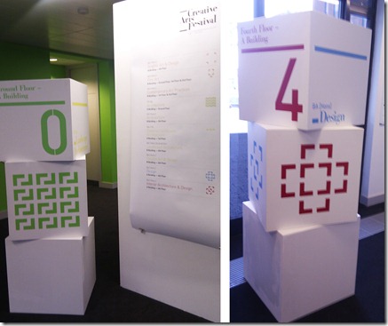
The exhibition ticket (top image) featured a series of symbols, white patterns on a colour background. Each symbol represents a different exhibition and the symbols are used throughout the building to guide visitors to each of the exhibitions.
floor guide

Floor guides feature the symbols alongside cubes mirroring the design of the outdoor sculpture. If you know which exhibition you want to go to you simply find your symbol and follow the prompts. This could be the coloured cubes dotted around outside, the stacked white cubes inside and then you know you are on the right floor as your symbol is featured on the stairwell. Excellent!

IMAG0436IMAG0471

For the more spontaneous guests just there to have a nosy there was another option to pick where you wanted to go. The wooden object below is like a game. You drop a ball in at the top and it can land in a number of slots, each representing an exhibition, where it lands is where you go.

005

Each of the exhibitions featured their own little quirky additions. I hate to admit it but the architecture department looked like it hadn’t really made that much of an effort in comparison to some of the other courses displaying work.

The interior design exhibition had balloons in the entrance. Each with a tag tied to the string at the bottom of the balloon. They made you want to interact and pull down a balloon to find out what it was all about. Each tag had a persons name and details on one side and a very apt, considered quote on the other. A fabulous first impression that wasn’t let down by the quality of the work on display. The interior design room was the one that really got me excited. Some of the display ideas were fantastic.

balloons

The graphic design room had the best ideas for getting the designers details out to the public and for getting feedback to the students direct from the public (typical clever clogs!).

A notice board at the entrance of the exhibition featured a tear off block of plans. The plan was a floor plan of the exhibition space, numbered to show the different display areas of the artists. On the back of the sheet was a key, a list of the designers and their contact details, blogs and websites. I really like this idea! A concise way of getting a huge amount of information across and a memorable addition to the exhibition.

IMAG0456

Alongside the plans was a series of hooks, on each of the hooks was a little tag with phrases such as ‘this got us chatting’, ‘this touched me’, ‘this required skill’ and ‘this got on my tits!’ Visitors could take a tag or two and hang it on a hook next to each designers work. This was my favourite part of the exhibition. The students who created the work were around the exhibition and the look of delight on their faces when they walked in and saw that people had liked their work was fantastic. After all the hard work that had gone into the production this simple feedback technique was fun for visitors and exciting for the students.

tags

I visited the exhibition to see my sisters degree work and finding a ‘this got us chatting’ tag on her work made mine and her day!

Leave a comment

Filed under Art, Branding, Exhibitions, Interiors, My Travels

Seat and Book Storage In One. Perfect For Students!

I am loving this little stool by Nju Studios. Inspired by a bunch of students using a stack of the designers magazines to prop open a door the designer was prompted to use the proportions and weight of magazines to create a functional piece of furniture.

0njustudisss01

When I saw it, I thought how perfect it would be in a student house. A place full of books, that often requires extra seating. It is ironic that it was students that inadvertently sparked this idea in the first place.

0njustudisss02

Having just packed up my student room after the end of another year, I seem to have added another box of books. Not only would this seat be perfect for its primary uses but would also make the books it stores easy to transport, a feature great for students who often live a split life between home and a university house.

Now where can I get my hands on one?

Images via Core77

Leave a comment

Filed under Furniture, Interiors, Materials, New Uses

Not Just A Floor! Take a Closer Look.

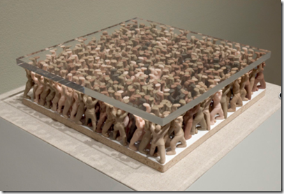
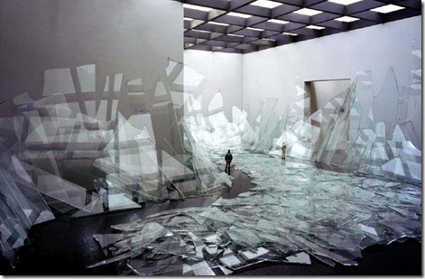
This installation, simply titled Floor is by the artist Do-Ho Suh. the piece is made up of glass plates that look as if they are being supported by little people. Standing on the platform visitors can only really see little dots of colour below them, It takes some closer inspection to really discover what the piece is about.

suh-1b

The piece created specifically for the Indianapolis Museum Of Art is extremely subtle in the space, unusual considering the complexity of the piece. The idea is that the piece discusses how people explore places, particularly communal spaces.

suh-floor-detail

The idea of standing on people may evoke other thoughts within the exhibitions users but I have to say I think this is extremely clever. A simple idea that has been executed very effectively, producing an exhibition that is a real experience for its users. Fantastic!

tumblr_le1loweasE1qzw5wjo1_500

1 Comment

Filed under Art, Interiors, Just For Fun

Incredible Mini Models by David DiMichele

daviddimicheleglass

For longer than a decade the artist David DiMichele has been producing these fantastic miniature installations in his studio. But it is the photographing of  the pieces, only a recent part of his process that has been grabbing peoples attention. His photography has created a whole new portfolio of work, not only recording his installation models but creating beautiful pieces of photographic art in the process.

daviddimichelesaltpepper

daviddimichelelightbeams

The collection of images is called Pseudo Documentation and with the artists careful consideration of composition and lighting the result is spectacular. On my discovery of the pieces I was convinced these were full size installations not scale models! I am completely in awe of his abilities, the models are so clean and and realistic. He is certainly someone I would love to sit down with to pick up of few tricks of the trade from.

daviddimichelehose

daviddimicheleholes

For the source of these images and more information about the artist and his works head of to his website here.

Leave a comment

Filed under Architecture, Interiors, Materials, Models, Photography

Nod To A Blog–Spoon & Tamago

Do you have a a series of blogs that you check daily? I certainly do and at the moment Spoon and Tamago is one of my favourites. The strap line of the site is ‘art, somewhere in between New York and Tokyo’ but what is included in the site ranges from technology, product design, fashion, art and architecture.

I find that often when I visit blogs I get a sense of déjà vu, much of the material I will have seen on other blogs but that isn’t the case with this site. I almost always find something new and exciting.

Below are a few links to some of my recent favourite articles. Enjoy!

Mizukagami

mizukagami1

Jun Igarashi | The Construction of  a State (Tea House 2006)

Teahouse1

Designer Workspaces

designer workspaces

Leave a comment

Filed under Architecture, Art, Furniture, Interiors, Nod To A Blog

Live/Work/Shop at The Fonte Da Luz

This beautiful restoration project in, Porto, Portugal was designed by Barbosa & Guimaräes Architects. When the area needed modernization due to a number of the buildings sinking, this one was saved, where others were demolished. The granite exterior was cleaned up and used as a shell for the modern fit out and extension that was installed.

Fonte Da Luz1Fonte Da Luz1b

The relationship between old and new must have been difficult to get right. Similar materials have been used to link the differing elements and I think the new additions are extremely honest. The housing element of the project sits across three floors, following the staircase up through the building and separated from a commercial unit and an office space.

I particularly like the mixture of uses in this project. It looks like it would be an incredible place to shop, live and work. I particularly like the sky lights, shown in the image above (via archdaily). As frameless as possible, the finishing has clearly been done to an extremely high level and the result is spectacular.

More images and information about the project is available on the archdaily website.

Leave a comment

Filed under Architecture, Interiors, New Uses, Office/Work Spaces, Residential, Retail

Great Bookshop, New York


Van Alen Books commissioned this incredible concept book store by LOT-EK. The image below shows the pre installation render of the proposed bookshop and the outcome is pretty accurate to this.

Bookshop Render

The design is pretty unique, I for one have never come across a shop that is entirely filled with stairs. I love the idea, the shop wont be able to house a huge collection of books but what it will offer is an extremely enjoyable browsing and reading space.

Bookshop1

Bookshop2

The bookshop will not only act as a retail space but will also be used for events. The social dynamic of the room will be unusual, with everyone on different levels and even people at the back of the room visible from outside the shop. The  outward looking nature of the shop is an unusual characteristic that I like but at the same time could be a distraction for those wanting to read or leave people feeling on show.

Leave a comment

Filed under Architecture, Interiors, Retail