Category Archives: Architecture

The UCLAN Creative Festival–Great Presentation Ideas You Could Reproduce

New to UCLAN studying my Masters I had not yet seen a degree show at the university so it was great to pop down to the Creative Festival on Friday and see what was on offer. A number of different departments had work on display, each department varying its presentation technique, below are some of the best bits.

IMAG0521

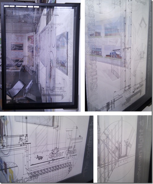
I first came across the Architecture degree show. Having studied Architecture for my undergrad at a different university it was interesting to look at how the styles differed from course to course. One piece stood out in particular for me. Bruce Johnson managed to take a, lets face it dull wall section and turn it into a piece of art (below). Unfortunately the full affect doesn’t come across on camera but Johnson had had layers of plastic laser cut, each plastic sheet depicting a different layer of the structural build up. The layers were then framed and then fixed perpendicular to the wall to give the greatest effect. I have found that the presentation of structural diagrams is something that is often ignored. This is understandable as legibility is a key factor but it was refreshing to see someone really pushing the presentation of this type of drawing.

Arch Drawing

Next up the Illustration Degree Show. A great collection of work with many unique styles on display and some beautiful display techniques. I particularly liked the use of picture frames and the way sketchpads and associated materials were displayed alongside large prints. My favourite work was by that of Naomi Jones (bottom left of the picture below), a full post about her work should be right below this one, or click here to read more.

Illustrations

Finally the Interior Design Degree Show! I may be biased but this was my favourite of the shows. The collective standard of the work was excellent and some great display techniques had been incorporated into the show.

IMAG0490

The course managed to combine technology and more simple materials together throughout the exhibition extremely effectively, managing to present the students work clearly and professionally.

IMAG0499

I particularly liked the cardboard display tables that had been produced to show models and the students portfolios. So clever, with a simple design that was produced in house, the result is neat and gives uniformity to the display. That combined with a bulb hung over the display table gives each student their own defined exhibition area.

Cardboard and hanging bare bulbs are both items that are extremely on trend in the world of interior design at the moment. To incorporate such objects into the exhibition is a great idea, it really shows that the students know what is happening in interior design, outside the confines of the studio.

Interior Design Display

UCLAN students are lucky enough to have access to a laser cutter. The intricate models below by Paula Ambler and Charlotte King show the high standard that can be produced at this level using such equipment.

Laser Cut Models

As in all departments the abilities of students varies. Many were able to produce high quality computer renders to give a real understanding of a space. This is something I aspire to be able to achieve myself but have not as yet learnt how to do. At this point I have been looking at the methods of producing visuals that don’t rely on complex visualisation packages. That is why the image below by Emma Brady really stood out. Bright, colourful and fun I was instantly drawn to it. It certainly gives an impression of the space in a more artistic way than just computer renders. I may give this kind of style a go myself!

IMAG0495

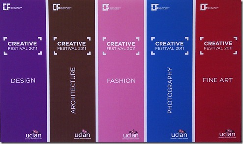
Many of the students had also provided business cards with some great illustrations reflecting the individual style of the student. Something that really caught my eye was this fold out portfolio disc case by Emma Cairns. Simple to produce but with bold graphics, the object reflected the students personal style well and gave a glimpse of her creativity before you even got to view her full portfolio. With employment at a low nationally, I do hope little tricks like this help give the students an advantage when it comes to finding a job in the future.

Portfolio Idea

Leave a comment

Filed under Architecture, Art, Exhibitions, Interiors, Models

Incredible Mini Models by David DiMichele

daviddimicheleglass

For longer than a decade the artist David DiMichele has been producing these fantastic miniature installations in his studio. But it is the photographing of  the pieces, only a recent part of his process that has been grabbing peoples attention. His photography has created a whole new portfolio of work, not only recording his installation models but creating beautiful pieces of photographic art in the process.

daviddimichelesaltpepper

daviddimichelelightbeams

The collection of images is called Pseudo Documentation and with the artists careful consideration of composition and lighting the result is spectacular. On my discovery of the pieces I was convinced these were full size installations not scale models! I am completely in awe of his abilities, the models are so clean and and realistic. He is certainly someone I would love to sit down with to pick up of few tricks of the trade from.

daviddimichelehose

daviddimicheleholes

For the source of these images and more information about the artist and his works head of to his website here.

Leave a comment

Filed under Architecture, Interiors, Materials, Models, Photography

Nod To A Blog–Spoon & Tamago

Do you have a a series of blogs that you check daily? I certainly do and at the moment Spoon and Tamago is one of my favourites. The strap line of the site is ‘art, somewhere in between New York and Tokyo’ but what is included in the site ranges from technology, product design, fashion, art and architecture.

I find that often when I visit blogs I get a sense of déjà vu, much of the material I will have seen on other blogs but that isn’t the case with this site. I almost always find something new and exciting.

Below are a few links to some of my recent favourite articles. Enjoy!

Mizukagami

mizukagami1

Jun Igarashi | The Construction of  a State (Tea House 2006)

Teahouse1

Designer Workspaces

designer workspaces

Leave a comment

Filed under Architecture, Art, Furniture, Interiors, Nod To A Blog

Vertical Grass

I have been researching ways of getting greenery into cities in unusual ways so have been looking at grass as wall coverings. Below are a couple of the best examples I have come across so far…

Grass 1a

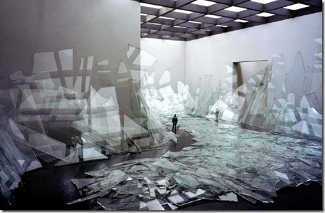
Heather Ackroyd and Dan Harvey have become famous for the work they have been doing with grass over the past decade. Their technique involves spraying a clay mixture over a surface and then individually planting seeds. The seeds are watered and grow for a couple of weeks to form a thick, layer of grass. Unfortunately the affect is only temporary but the result is staggering. The building above is Dilston Grove, a beautiful but now derelict cathedral. The entire inside and outside of the structure was covered by the pair to create this fantastic piece of art.

grass 2a

This showroom designed by Vector Architects to display green technology has a more permanent grass covering. A grass panel system is used to cover both the walls and the roof of the structure and has a number of benefits including a  high thermal efficiency on top of its great appearance.

I don’t think I have ever seen a grass wall in person but I think they would be a great addition to many cold, grey urban environments in the UK.

Leave a comment

Filed under Architecture, Art, Cities, Landscapes, Materials

Live/Work/Shop at The Fonte Da Luz

This beautiful restoration project in, Porto, Portugal was designed by Barbosa & Guimaräes Architects. When the area needed modernization due to a number of the buildings sinking, this one was saved, where others were demolished. The granite exterior was cleaned up and used as a shell for the modern fit out and extension that was installed.

Fonte Da Luz1Fonte Da Luz1b

The relationship between old and new must have been difficult to get right. Similar materials have been used to link the differing elements and I think the new additions are extremely honest. The housing element of the project sits across three floors, following the staircase up through the building and separated from a commercial unit and an office space.

I particularly like the mixture of uses in this project. It looks like it would be an incredible place to shop, live and work. I particularly like the sky lights, shown in the image above (via archdaily). As frameless as possible, the finishing has clearly been done to an extremely high level and the result is spectacular.

More images and information about the project is available on the archdaily website.

Leave a comment

Filed under Architecture, Interiors, New Uses, Office/Work Spaces, Residential, Retail

Great Bookshop, New York


Van Alen Books commissioned this incredible concept book store by LOT-EK. The image below shows the pre installation render of the proposed bookshop and the outcome is pretty accurate to this.

Bookshop Render

The design is pretty unique, I for one have never come across a shop that is entirely filled with stairs. I love the idea, the shop wont be able to house a huge collection of books but what it will offer is an extremely enjoyable browsing and reading space.

Bookshop1

Bookshop2

The bookshop will not only act as a retail space but will also be used for events. The social dynamic of the room will be unusual, with everyone on different levels and even people at the back of the room visible from outside the shop. The  outward looking nature of the shop is an unusual characteristic that I like but at the same time could be a distraction for those wanting to read or leave people feeling on show.

Leave a comment

Filed under Architecture, Interiors, Retail

The Hypothetical Loitering Centre

The Hypothetical Development Organization was set up in 2010 in New Orleans and I have been keenly following the progress of the group since I discovered them last year.

The company aims to find “hidden gems”, mostly derelict or unused buildings within their neighbourhoods and then sets about in coming up with a conceptual proposal for the space. The organization then produces renders of the proposal and pins them up on the building.

By this form of guerilla advertising of the hypothetical it highlights the potential of buildings in the hope that developers will take the hint and make the most of the space.

No Loitering 1

This is my favourite of the recent proposals, The New Orleans Loitering Centre. It turns its back on the common ‘No Loitering’ policy in place in many urban environments. For me the idea is great, particularly in sunnier climates I can see this idea being a brilliant social, meeting space for strangers and friends.

Loitering Centre1

Now if only someone would actually build it! The centre would certainly be a vast improvement on the current building, pictured above.

More information on The Hypothetical Development Company and the individual projects is available on their website.

Leave a comment

Filed under Architecture, Cities, Just For Fun, New Uses, Pop Up

Shop/House

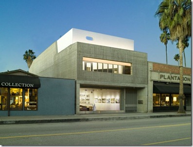
This townhouse in Venice, California by Dennis Gibbons Architects is part retail space and part private family residence. Really this isn’t a new idea. Traditionally shop keepers would live above their shop but in more recent times there has been a total separation of retail and residential. I am glad that these mixed use projects are returning. I can name many UK high streets that have a second storey that is completely unused and would be viable for residential conversions.

Townhouse 1

It is not just the project that has a mixture of uses. The street it sits on is also fairly varied. The road contains a number of uses including, small family homes, boutiques, independent stores and artists who live, work and display in the same building. For me this is fantastic, it is the complete isolation of high streets in the UK that can in part cause there failure. By mingling uses and creating a wealth of unique shops and galleries there is a direct local population of customers as well as a pull to the area for outsiders.

Townhouse 3Townhouse 2

It also helps that the shop and living space is so beautiful! More information and images can be found on Dennis Gibbens Architects Website or on the Contemporist blog.

Leave a comment

Filed under Architecture, Cities, Interiors, New Uses, Residential, Retail

Shop On A Corner

During my design work at university I have been contemplating what could be achieved by carving up existing buildings to create more interesting internal and external spaces. This combined with retrofit is an element of my high street renewal project.

In order to inform my design process I have been looking for buildings that have been adapted or simply buildings whose form creates more dynamic spaces.

Shop On A Corner 1

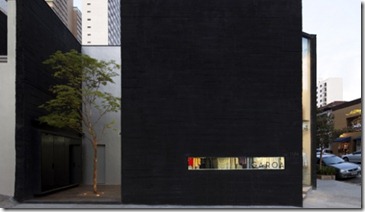
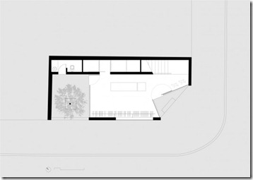
The Garoa store Sao Paulo by Una Architects (above) may not be an adaptation, (it was built from scratch on a small corner plot) but its plan is extremely interesting. The corner plot in retail and architectural terms is quite interesting as it gives double the exposure onto the street. In this case the architects didn’t want to just consider the building as facades, instead by creating an indentation at the corner point of the plan and with the clever junction of transparent and opaque materials, an appreciation of the volume of the space is instead afforded to the viewer.

Shop On A Corner 6

Walking along the street towards the store you may just be presented with a black concrete wall that has been carefully cut away to give a glimpse at what is held inside and then when you round the corner the space opens up to you. From this corner point you can see straight through the building to the small courtyard behind the sales floor. The flooring continues inside and out, visually blurring the lines between the internal and external. To view the building at different angles is exciting! It is this sense of drama and the consideration of the users discovery of the store and experience once inside that I find most fascinating.

Shop On A Corner 1a

Click here for more information on this project.

Leave a comment

Filed under Architecture, Cities, Interiors, Retail

Retail Envy

In my quest to come up with a new concept for a failing high street I have been looking at stores that occupy spaces differently and the retail project below certainly fills this criteria.

The store is a collaboration between fashion designer Siki Im and design office Leong Leong. The project sees existing spaces transformed with the introduction of a unique intervention. In this case the intervention is also a retail space in New York.

Siki Im Leong Leong 1bThe structure was once a trailer, used for sales and has been completely transformed both internally and externally. The inside has been split with a ramp that creates a gathering space above and a more intimate space to display clothes in below. The structure has been covered and reshaped with the use of a soy-based spray foam. Users are encouraged to explore the space, almost happening upon the collection of clothes at each end of the ramp. Seating and display areas are carved directly out of the foam, creating further niches to be used and explored. The structure ‘reinforces the dichotomy of two environments – public and private, visible and invisible.’.

Siki Im Leong Leong 1aThe space is beautiful and I can imagine shopping here would be quite an experience. The collection is slick and modern and is a complimentary contrast to the rough, more organic surface of the structure.

The introduction of a temporary structure such as a trailer or mobile home that could be completely transformed by a designer would be an interesting introduction to my high street. Although this may be a costly idea it could give rise to a number of fascinating collaborations between designers. The opportunity to produce retail spaces housed in sculptural forms, embeded in the high street would be brilliant!

For more images and information about the Siki Im Store click here.

Leave a comment

Filed under Architecture, Cities, Interiors, Materials, Retail